Design Infrastructure from Scratch
SideQuest Master Design System/Kit
Date
2025-present
Project
SideQuest Master Mobile App
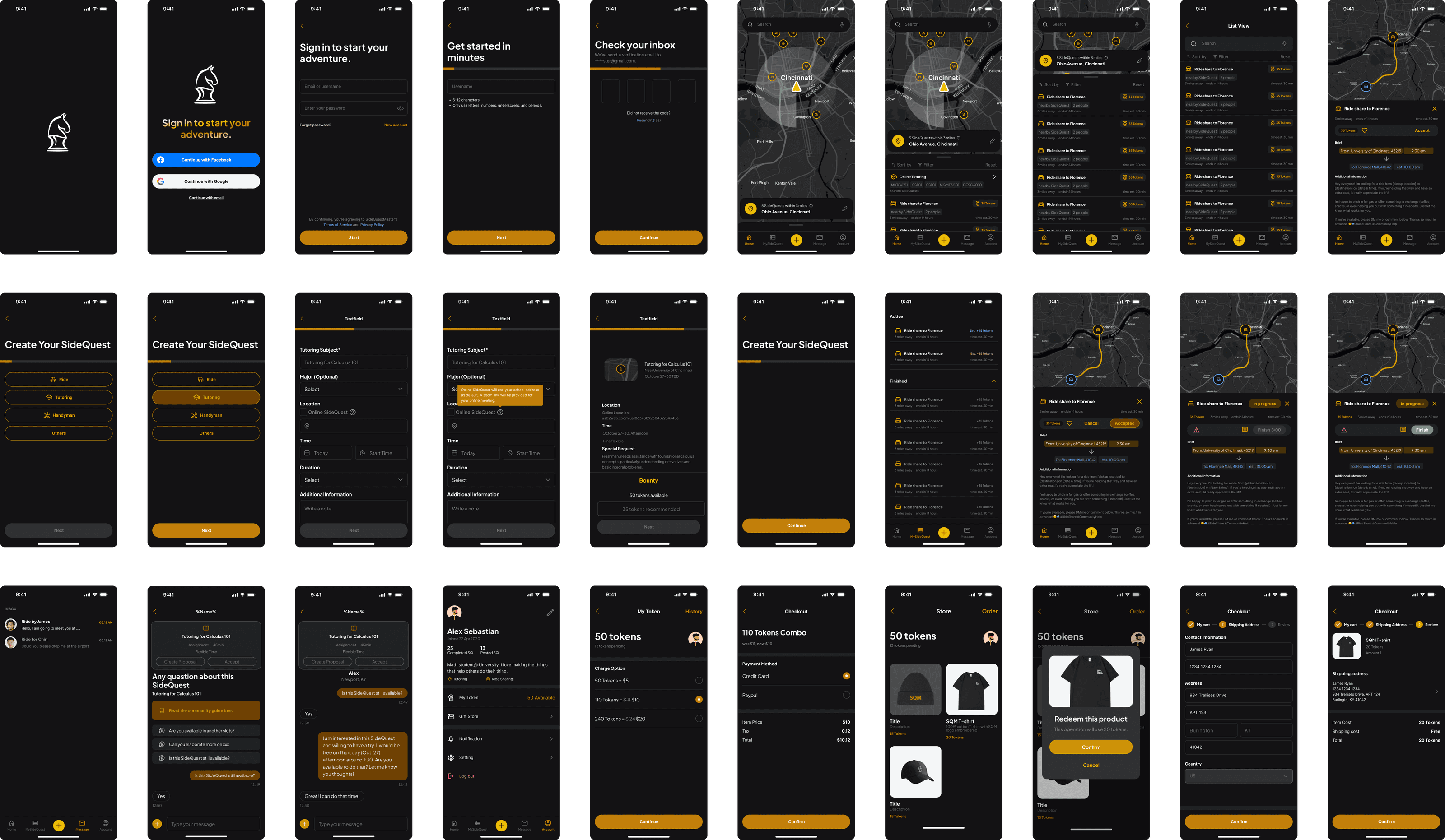
SideQuest Master is a mobile app startup designed to enhance real-life experiences through skill-sharing and mutual help. As the product designer, I led efforts across product definition, branding, and high-fidelity prototyping to support the minimum viable product (MVP) design, and a customized design system to accelerate the product development.


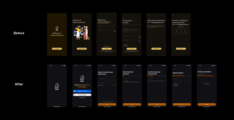
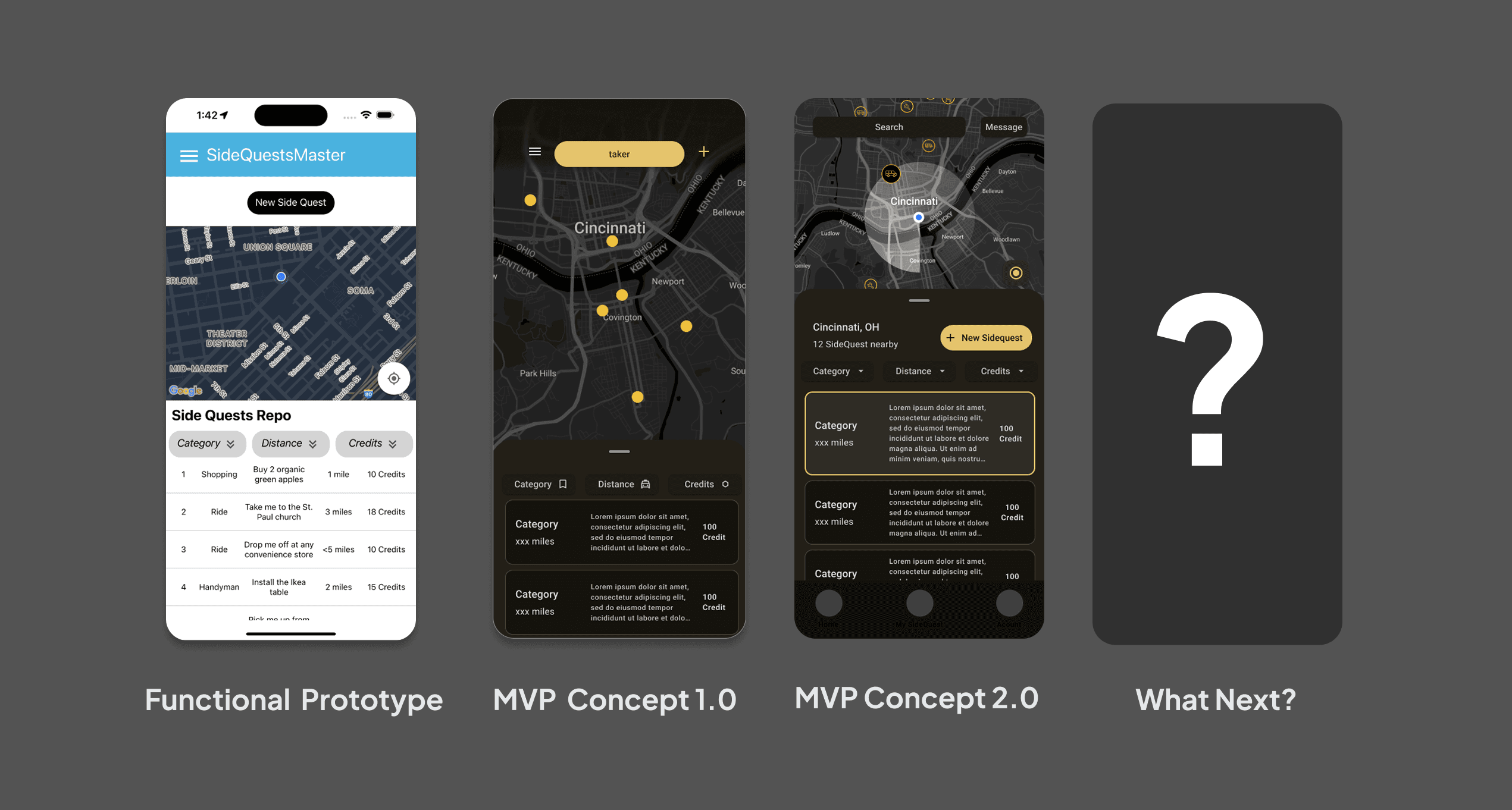
When I joined, the team had only a rough concept and a low-fidelity homepage wireframe. There was no existing design infrastructure, no brand identity, and no shared design language. Developers relied heavily on prebuilt UI components, which led to fragmented interfaces and inconsistent user experiences.
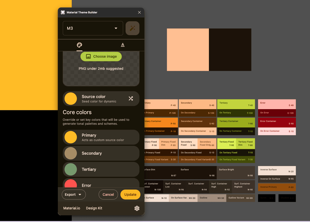
The team started with using Material Design system for UI consistent and designer-developer alignment. However, the variables and styles proved too complex for a small team to modify and maintain efficiently. As a consumer-facing mobile app, we needed a faster, more flexible approach—one that maintained clarity without compromising brand expression.
How might we create a lightweight, consistent design system that supports rapid iteration and reflects our gaming-inspired vision?
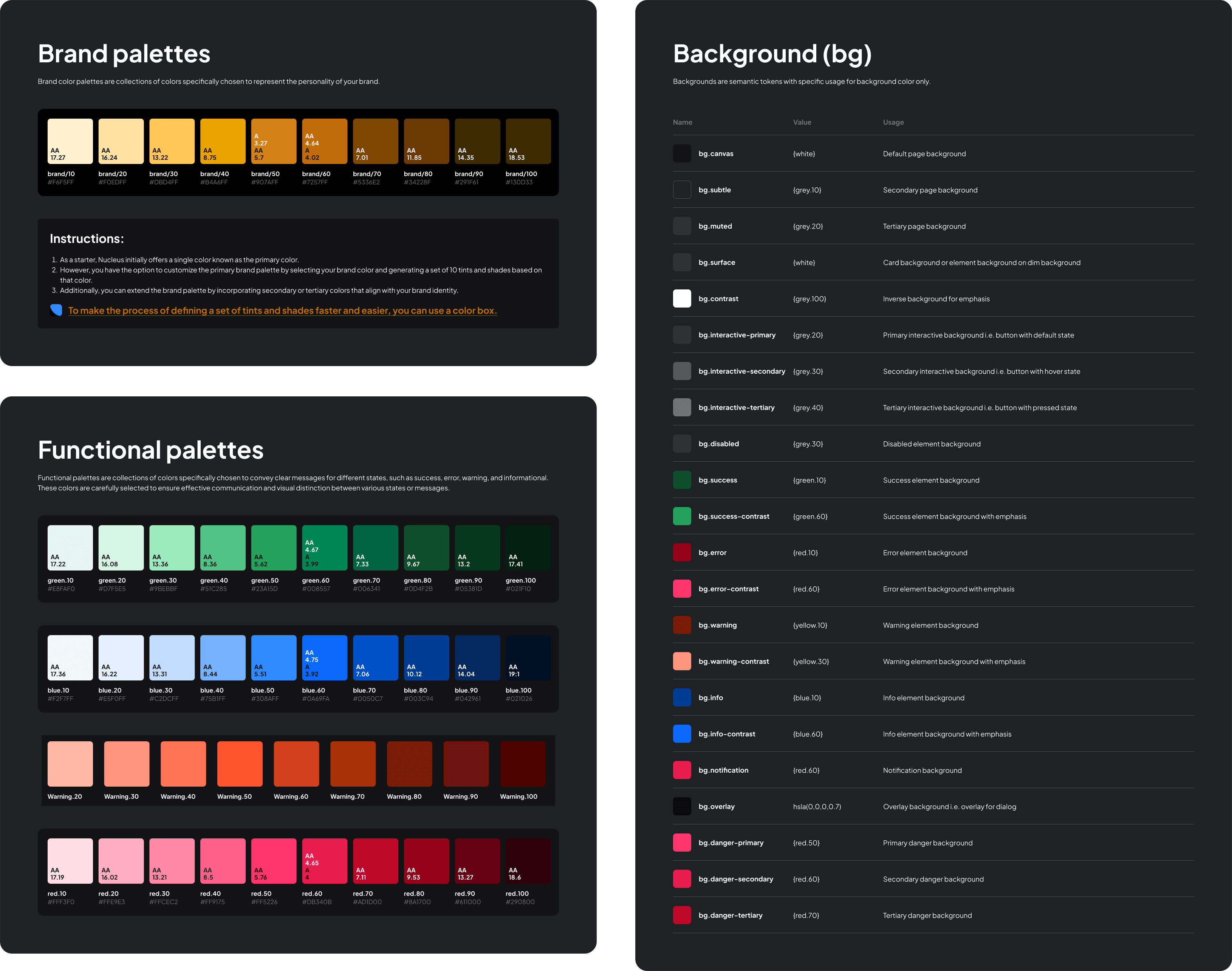
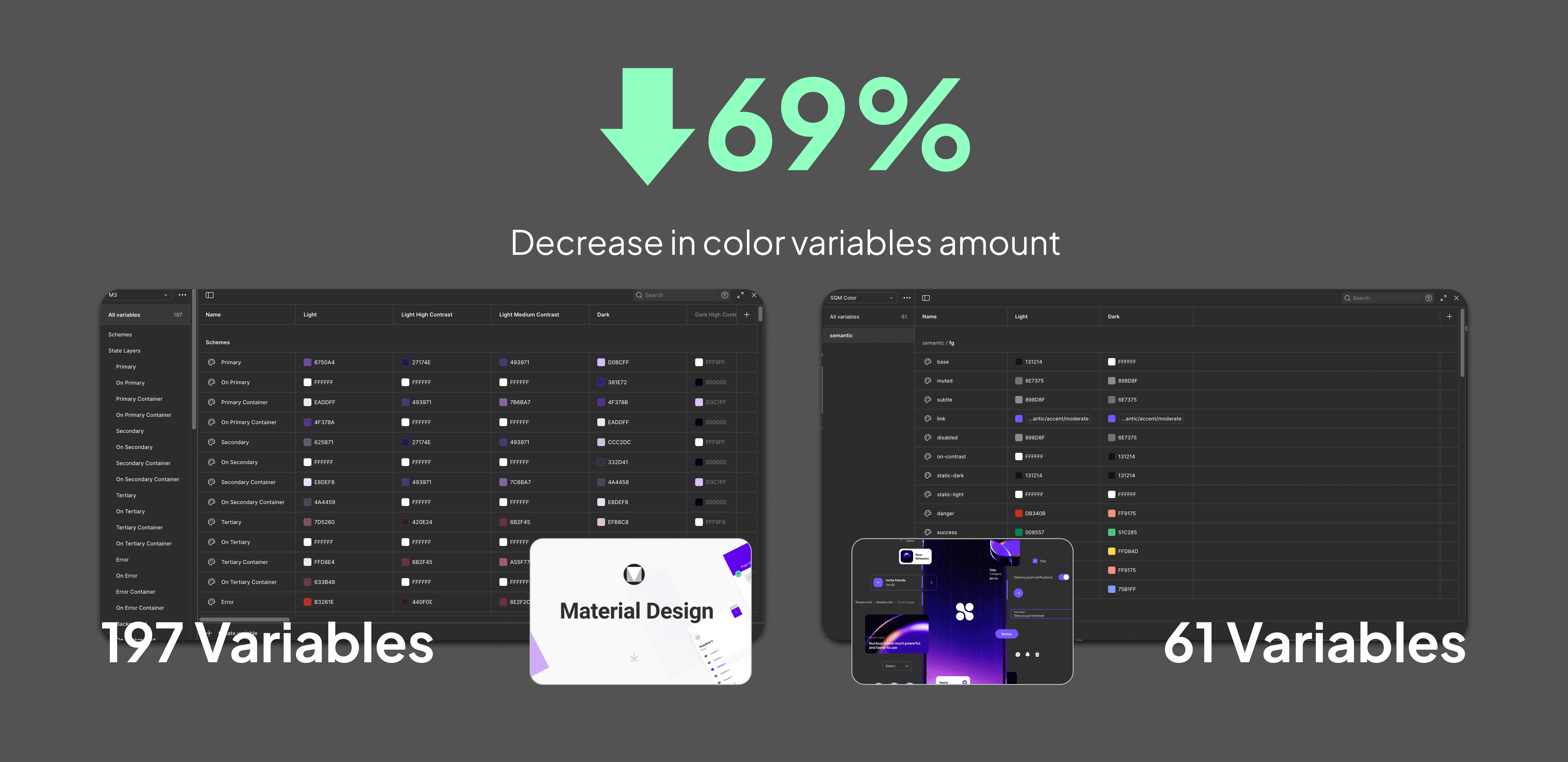
Researched existing design systems and adapted a lightweight structure tailored to startup needs and customized based on Nucleus UI for a minimal token set for color, spacing, and typography

Compared to the previous Material Design system, Nucleus uses foreground (fg) and background (bg) to organize color variables. This naming convention significantly reduces the number of design tokens required from 197 to 61.
As a customer-facing product, we launched with a playful, fame-inspired brand theme and selected Amber Gold as our primary color to reflect that energy.

Our theme color was visually close to the original warning color, which caused confusion in the UI. To improve distinction, I rotated the warning and error hues slightly counterclockwise on the color wheel, so that we could maintain accessibility while enhancing visual clarity.